Implementing AiForms.Dialogs with Xamarin Forms

If you prefer to read this article in Spanish, please follow this link
Disclaimer: the purpose of this post is not to offend nor insult any graphic or UI/UX designer, but to make a little fun of myself and to my lack of design skills.
We usually work in teams, sometimes they are small, other times they are big, but almost every team have at least one UI/UX designer or someone from the client that provide design to our projects.
Occasionally designers get overly creative and ask us to do some unconventional controls or something even harder like some custom alert dialogs!!!
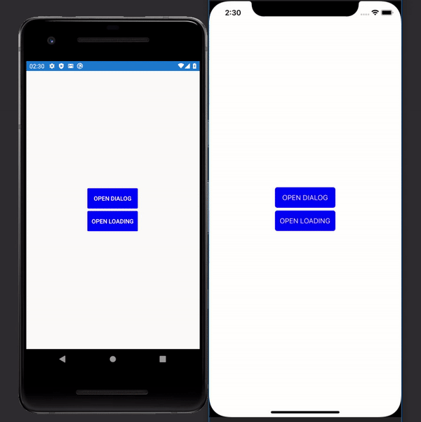
Let’s take a look to the image below to appreciate the most incredible popup alert design, if our application was like a website from last decade…

As we can see, our special alert popup doesn’t fit with the Xamarin.Forms built-in dialogs library.
We can’t accomplishthe task with the great and widely used Acr.UserDialogs library neither.
If we keep searching, we might come across with other popular plugin, of course I’m talking about Rg.Plugins.Popup. Apparently seems to be what we need for, but with our curious and restless souls, we keep researching a little more, just in case, until we run into this small but powerful library named AiForms.Dialogs.
I call it small, because isn’t widely known/used as its contrincant, almost 30 thousand downloads on Nuget against over 2M from Rg.Plugins.Popup.
Let’s compare them!
Rg.Plugins.Popup:
- Allows you to create Xamarin.Forms pages and launch them as popup that can be shared across iOS, Android, UWP, and macOS.
- Provides cool animations!
- The implementation lies only on Xamarin.Forms, only use page renderers on the native side.
- Uses it’s own navigation system to push and pop the popup pages.
- Easy to implement Unit Testing with it.
AiForms.Dialogs:
- Allows you to create Xamarin.Forms pages and launch them as alert popup, toast or loading indicator, that can be shared across iOS and Android.
- Allows you to create your own animations.
- Implementations are native (using
DialogFragmenton Android andUIPresentationControlleron iOS for example). - Includes reusable dialog and loading, this means that
disposemethods are not executed in order to reuse them during the page lifecycle. - No need to use any custom navigation.
As we can see Rg.Plugins.Popup could be a great option, mostly because it support a much greater range of platforms and Unit Testing, but AiForms.Dialogs offers loadings and toast customizable views that even relay on native implementations. Our crazy designer would be really happy!
Let’s get down to work!
First we need to install the AiForms.Dialogs nuget package in our Forms, Android and iOS projects.
Remember that you need to initialize the package on Android, after the Xamarin.Forms initialization:
AiForms.Dialogs.Dialogs.Init(this);Then on our Xamarin.Forms project lets create a regular ContentView, but change it to be a DialogView and create our view as usual but add some small extra properties to our base DialogView:
OverlayColor: the background overlay color for our alert (default is white or transparent).UseCurrentPageLocation: acording to the plugin documentation this boolean property will define if our alert will be aligned to the window borders or the current page area. In our case we will set it tofalse.IsCanceledOnTouchOutside: this boolean property will simply define if the user can close the alert by touching the area outside it. In our case we will set it tofalse.
Note: If you set the BorderColor property remember to add a background color to the content of the DialogView, otherwise it will take the BorderColor as content’s BackgroundColor.
Then this will be the XAML of our alert:
And remember to change base type from ContentView to DialogView on the code behind.
Also remember to correctly set the DialogNotifier for the action buttons, these are really important in case we are listening the events to know which option the user pick.
And by last we need to open the dialog by calling the Dialog.Instance abstraction, but remember this is an async method and we should use the await keyword, so we can use Device.BeginInvokeOnMainThread if we are not inside an async method.
The ShowAsync<TDialogView>() method return a Task<bool> that it’s setted through the DialogNotifier.Cancel() and DialogNotifier.Complete() methods and can be used to execute other parts of our code on each response.
This is our result on both platforms:

As we tell the designer the goodness of our recently discovered tool, he’s thinking about the next crazy request…
Since he loves Ryan Reynolds (who doesn’t, right?), now requests a loading that contains an animated face of Reynolds, together with an inspirational quote, so we will fulfill his wishes!
As we did before, let’s create another ContentView and change the base type to a LoadingView this time, then set the OverlayColor to gray and add our content inside a StackLayout.
This will be the XAML of our custom loading:
Change the base type to LoadingView on the code behind, then create the animation in the constructor method and consume the animation with RunPresentationAnimation and RunDismissalAnimation methods provided by the plugin to run and destroy the animation.
Let’s see the final result!
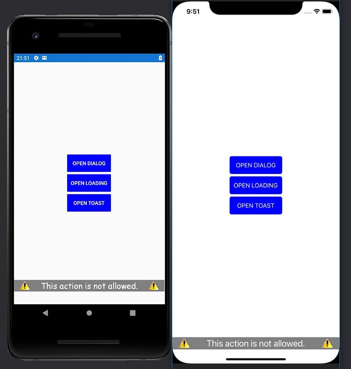
Now he decided that we should warn users through toast using next guideline
Once again, create a new ContentView and change it base type to ToastView and this time we need to set some properties:
HorizontalLayoutAlignment: How it will be positioned horizontally. In our case we set it toFill.VerticalLayoutAlignment: Where the toast will be positioned vertically. In our case we set it toEndto placed at the bottom of the screen.OffsetY: if we place our toast to top or bottom of the screen, we will need to use this property to adjust the position, specially with iOS because it will not respect theSafeAreaadjustment. In our case we set it to-35.Duration: expressed in milliseconds, this will determine how long our toast will be visible on screen. In our case we set it to3000.
This will be the XAML of our toast:
Remember to change the base type to ToastView on the code behind. Also remember that you can add animations to it.
Let’s see the final result!
Our crazy designer liked the design of the alert popup that much that he wants to use it for every single one that will appears in the application.
To perform this task and to anticipate possible future special request from our designer, let’s create a helper class that can be register as singleton, so it will help us to use it both from our views and from our viewmodels.
Let’s define our interface methods
If we break it down:
- A
ShowAlertmethod to display our alerts, with some required parameters and some optional parameters and returns a bool that indicates if alert was cancelled or accepted. - Two
ShowLoadingmethods, taking advantage of c# inheritance, we defined a method for regular loadings and another that take a parameter to display a message while loading view is visible. - A simple
HideLoadingmethod to hide our loading view. - A special method
ShowLoadingWithProgressAsyncto show a progress count when loading, for example if we want to let users know a file download progress. It take aFunc<IProgress<double>, Task>as parameter to pass it on to the loading view and a string to show some custom message while loading view is visible. DisplayToastwill help us to show a simple toast, we pass a message and duration expressed in milliseconds, we define a default duration of 3 seconds.
And now the implementation:
First we define the implementation of our singleton for the helper.
Then let’s take a closer look to the ShowAlert implementation:
This would be our alert view
It’s almost the same as our WinMoneyDialogView but we change the texts with some binding: DialogText, AcceptText and CancelText. These names can be whatever we want, but must be the same when creating the view as we can see here:
await Dialog.Instance.ShowAsync<DefaultDialogView>(new
{
    DialogText = dialogText,
    AcceptText = acceptText,
    CancelText = cancelText
});
The library will take care of convert those bindings.
Now, if we take a look to the first ShowLoading implementation, we simply call the default implementation of the library loading and we set a default message.
On the second implementation, we call the Show method first and then the SetMessage method with our custom message.HideLoading will simply call the Hide method of the library.
ShowLoadingWithProgressAsync as same of ShowAlert, will be an async method, we simply pass the func and the message down to the StartAsync method, that take the same Func<IProgress<double>, Task> and the message.
Finally for the DisplayToast method we need to create a new toast view:
As same as ShowAlert we need to pass the binding
Toast.Instance.Show<DefaultToastDialogView>(new
{
    ToastText = toastText,
    Duration = duration
});
Test time
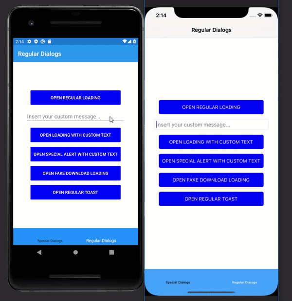
To test our helper implementation we will create a view and viewmodel associated to it.
We add bindings to our viewmodel and some implementation on code behind to test.
OpenRegularLoadingcall our instance of ourDialogHelperand will display a loading for 3 seconds.
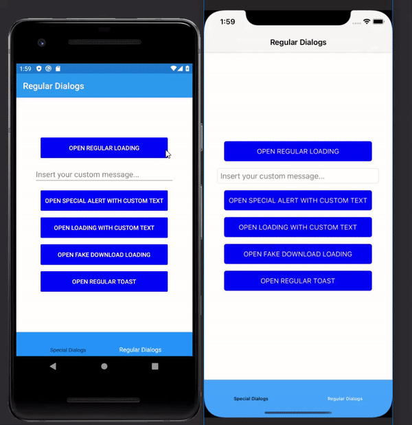
OpenLoadingWithCustomTextwill take the text from theEntryand show the loading with it.

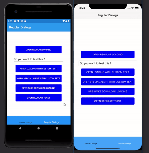
OpenDialogWithCustomTextthis was the original request from our designer, we pass on it a custom message and define “Yes”/”No” as options.
OpenFakeDownloadLoadinghere we will fake a downloading task to test the progress.

OpenRegularToast_Clickedwe implement this method on the code behind of our xaml view to test if our dialog helper works there too. We pass it some text and the duration
That’s all folks
I think this is a really useful library and highly recommend you to try it and if you like it, leave a star on the repo because Kamu (the creator) really deserve it.
Also you can see my complete sample repository for this post on GitHub.
Thanks for reading and keep coding while Vincent Connare laughs from hell 😁
